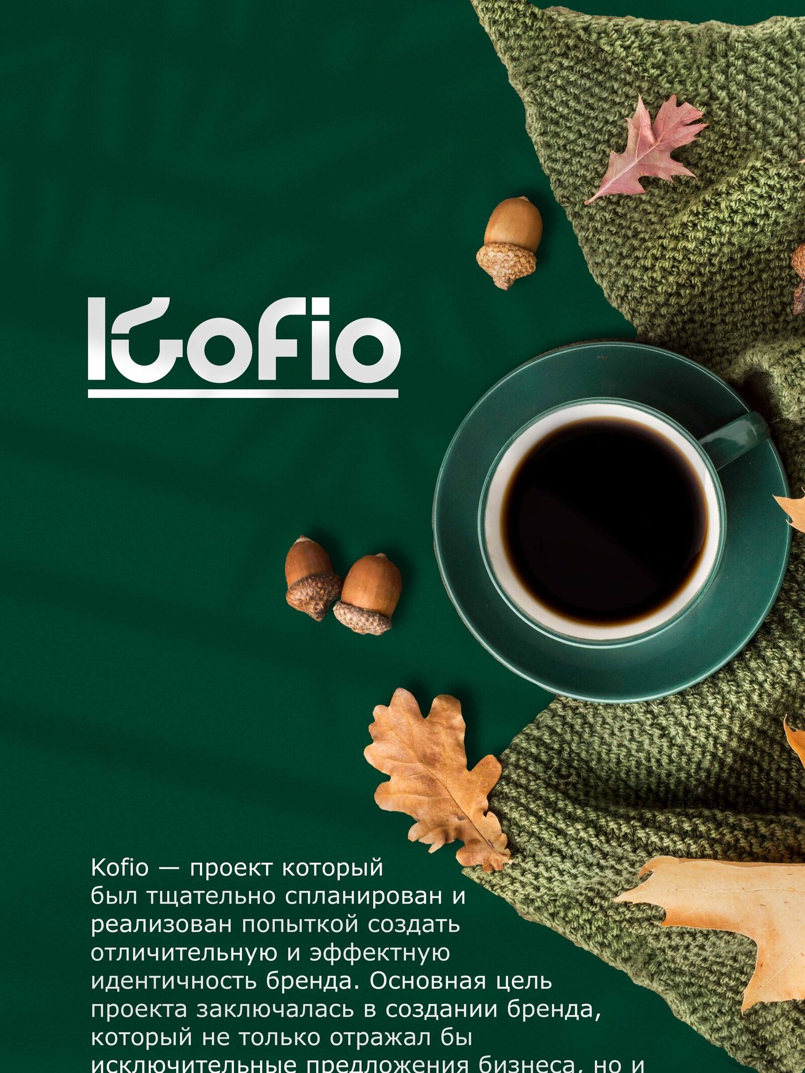
Kofio

The task
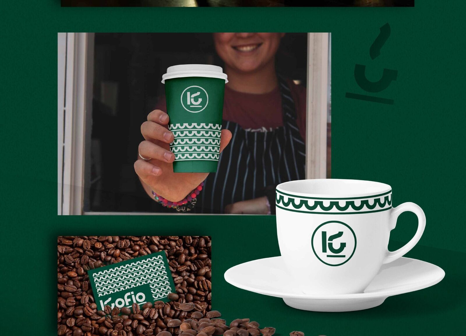
A new coffee shop in a fiercely competitive neighbourhood. The brand had to be memorable at a glance — on a cup in a passer-by’s hand.
The solution
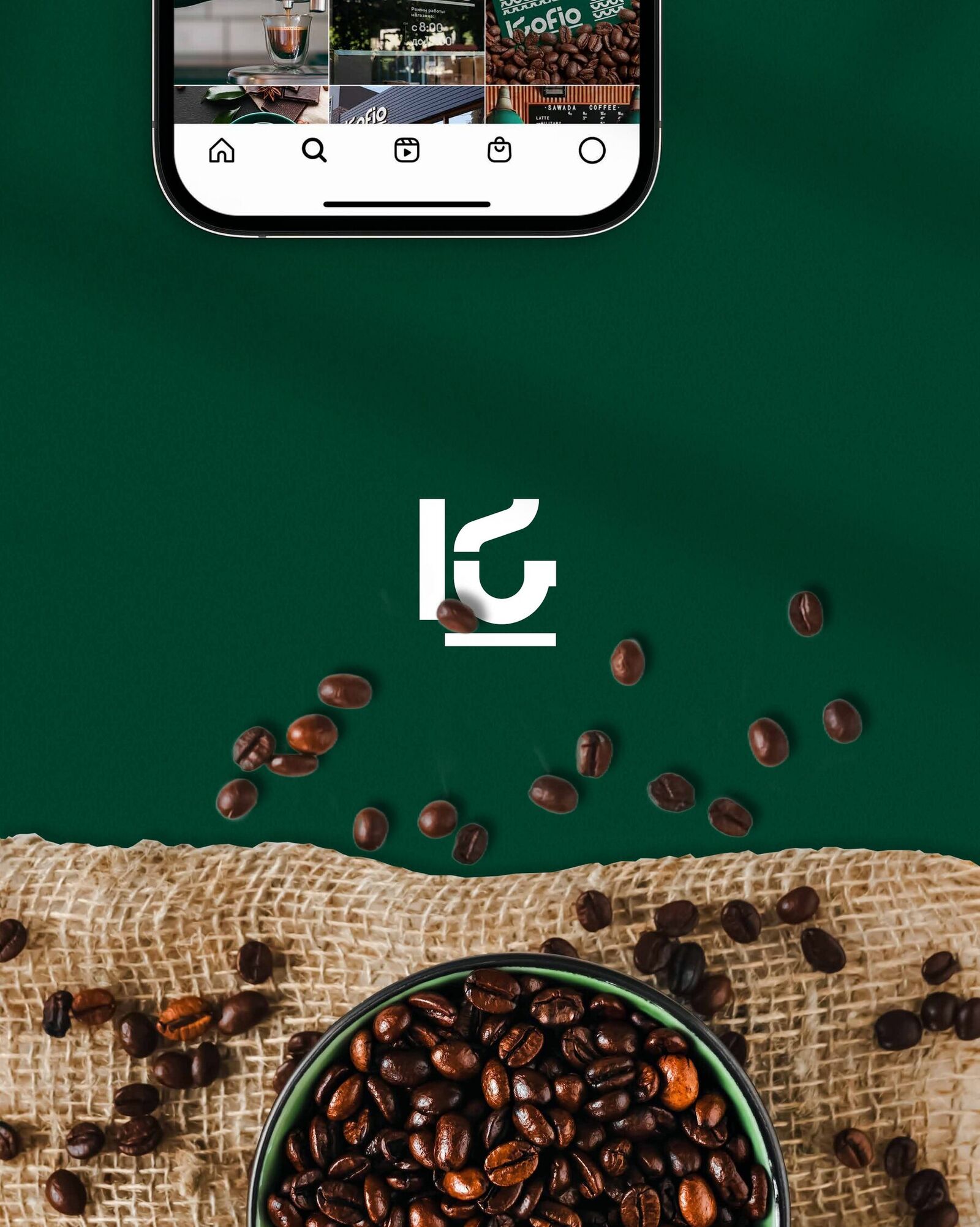
The K mark combines three things: a letter, a cup and steam. It works both as a standalone symbol and inside the logo. The lines of steam form a pattern for cups and packaging. Dark green, white and a warm orange accent.